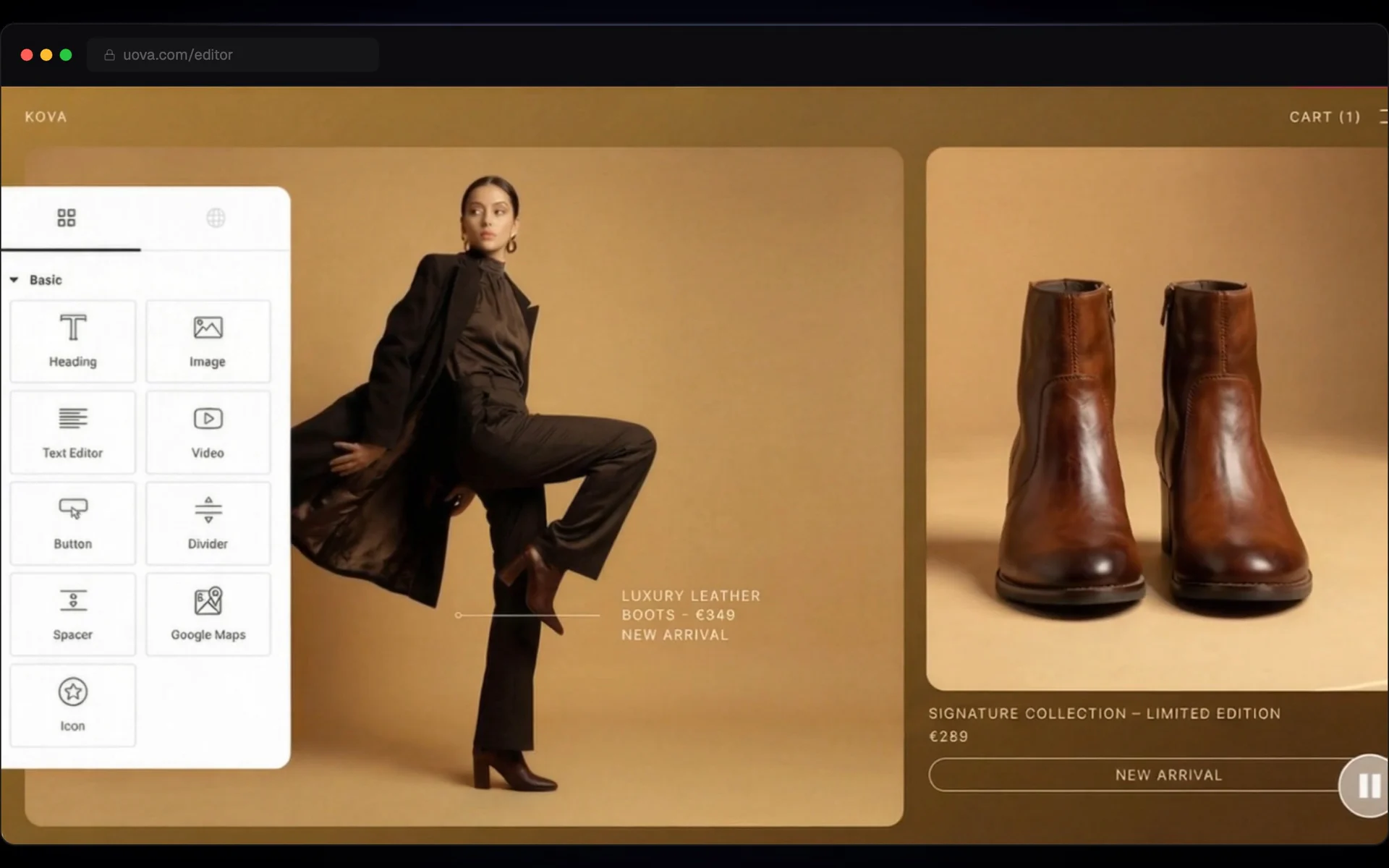
A product demo should explain the work
Show the starting point, the decisions and the finished result.
Start before the impressive screen
A polished result is easier to judge when viewers can see what produced it. Start a website demo with a short brief and the source material supplied. If the result uses a prepared template, say so. If the sequence has been edited for length, make that clear. Viewers can then understand the relationship between their own effort and the result being demonstrated.
Choose one complete journey
A demo does not need to tour every menu. Choose a useful task and finish it: create a page, revise its headline, replace an image and inspect the mobile version. A complete journey gives each step a purpose. Jumping between unrelated features may produce more movement on screen, but it makes it harder to remember what the product helped someone accomplish.
Show a revision
The first version is only part of creating a website. Include a change that a real owner might request: a different service order, a shorter headline or a replacement photograph. Show the action and the resulting page together. When a change has consequences elsewhere, show those too. This helps a viewer judge whether the product remains useful after the first reveal.
Explain the limits of the demonstration
A form appearing on screen is a design demonstration until delivery has been checked. A checkout screen is not evidence of a completed sale. Name the scope in ordinary language: “This is a sample layout”, “This test message arrived” or “This integration still needs configuration.” Precise wording makes the demonstration more informative and gives the next test a clear starting point.
Let the result remain visible
After a change, pause long enough for someone to read it. Use a consistent browser size and keep the pointer away from the main text. If a section matters, frame it closely enough to inspect. A brief explanation of why the change was made is often more useful than a fast sequence of effects. The viewer should be able to connect the instruction, the action and the outcome.
Finish with a usable next step
Close with the exact action the viewer can take and the prerequisites they will need. For a website builder, that might be preparing a service description and a few approved images before starting. This is the approach I want my UOVA walkthroughs to take: clear inputs, visible decisions and an outcome people can assess for themselves. These are working principles for future demos, not claims that every feature or integration has already been verified.